
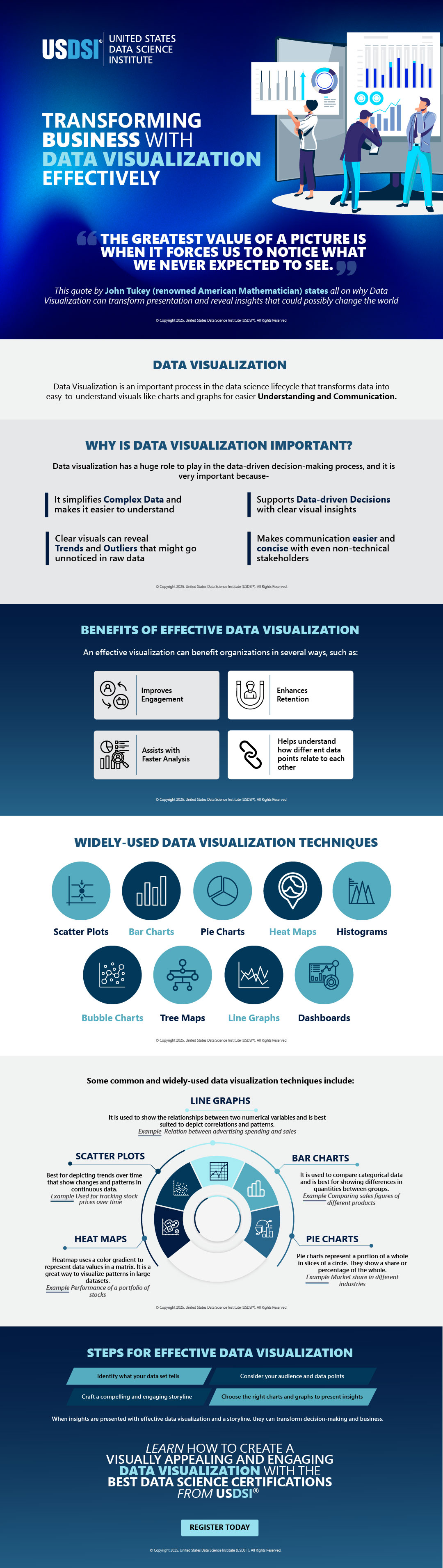
Making sense of complex information can really help organizations transform their businesses. Data visualization is one such process in the field of data science that helps professionals transform complex data and insights into easy-to-understand visuals that can help decision-makers and stakeholders make informed and data-driven decisions.
As truly said by John Tukey, “the greatest value of a picture is when it forces us to notice what we never expected to see”, data visualization can help find trends and patterns in data that otherwise would go unnoticed with traditional analysis techniques.
In the following infographic on “Transforming Business with Data Visualization Effectively”, we discuss the importance of data visualization in the business world, its important role in a data science lifecycle, and what benefit it offers to decision-makers.
The infographic also explores various types of data visualization techniques, such as Line graphs, scatter plots, heat maps, pie charts, etc., and explains how to choose the best one depending upon the required purpose.
Whether you are looking to start your career in data science or want to advance in your existing role, a solid understanding of various data science tools and techniques is highly essential.
Ready to see how data can drive results?
Check out the infographic now and start transforming your business—one insight at a time.
This website uses cookies to enhance website functionalities and improve your online experience. By clicking Accept or continue browsing this website, you agree to our use of cookies as outlined in our privacy policy.